This function creates a generic clinical significance plot by plotting the patients' pre intervention value on the x-axis and the post intervention score on the y-axis.
Usage
# S3 method for cs_distribution
plot(
  x,
  x_lab = NULL,
  y_lab = NULL,
  color_lab = "Group",
  lower_limit,
  upper_limit,
  show,
  point_alpha = 1,
  trajectory_alpha = 1,
  rci_fill = "grey10",
  rci_alpha = 0.1,
  overplotting = 0.02,
  ...
)
Arguments
- x
An object of class
cs_distribution- x_lab
String, x axis label. Default is
"Pre".- y_lab
String, x axis label. Default is
"Post".- color_lab
String, color label (if colors are displayed). Default is
"Group"- lower_limit
Numeric, lower plotting limit. Defaults to 2% smaller than minimum instrument score
- upper_limit
Numeric, upper plotting limit. Defaults to 2% larger than maximum instrument score
- show
Unquoted category name. You have several options to color different features. Available are
category(shows all categories at once)improved(shows improved participants)unchanged(shows unchanged participants)deteriorated(shows deteriorated participants)
- point_alpha
Numeric, transparency adjustment for points. A value between 0 and 1 where 1 corresponds to not transparent at all and 0 to fully transparent.
- trajectory_alpha
Numeric, transparency adjustment for trajectories. A value between 0 and 1 where 1 corresponds to not transparent at all and 0 to fully transparent.
- rci_fill
String, a color (name or HEX code) for RCI fill
- rci_alpha
Numeric, controls the transparency of the RCI. This can be any value between 0 and 1, defaults to 0.1
- overplotting
Numeric, control amount of overplotting. Defaults to 0.02 (i.e., 2% of range between lower and upper limit).
- ...
Additional arguments
Examples
cs_results <- antidepressants |>
cs_distribution(
patient,
measurement,
pre = "Before",
mom_di,
reliability = 0.80
)
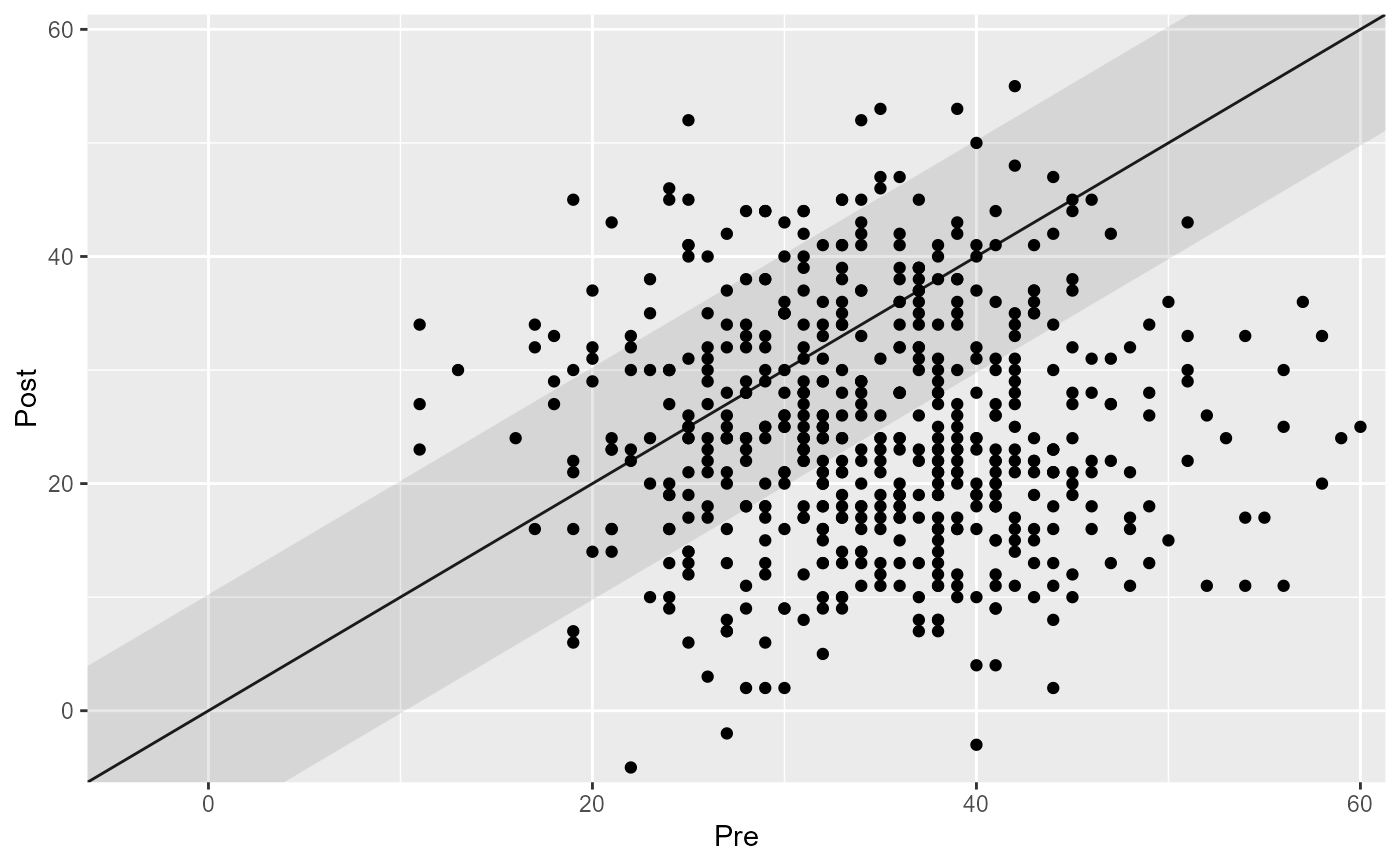
# Plot the results "as is"
plot(cs_results)
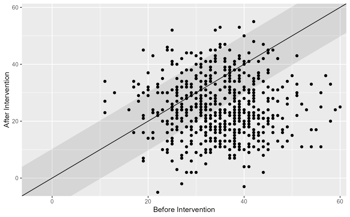
 # Change the axis labels
plot(cs_results, x_lab = "Before Intervention", y_lab = "After Intervention")
# Change the axis labels
plot(cs_results, x_lab = "Before Intervention", y_lab = "After Intervention")
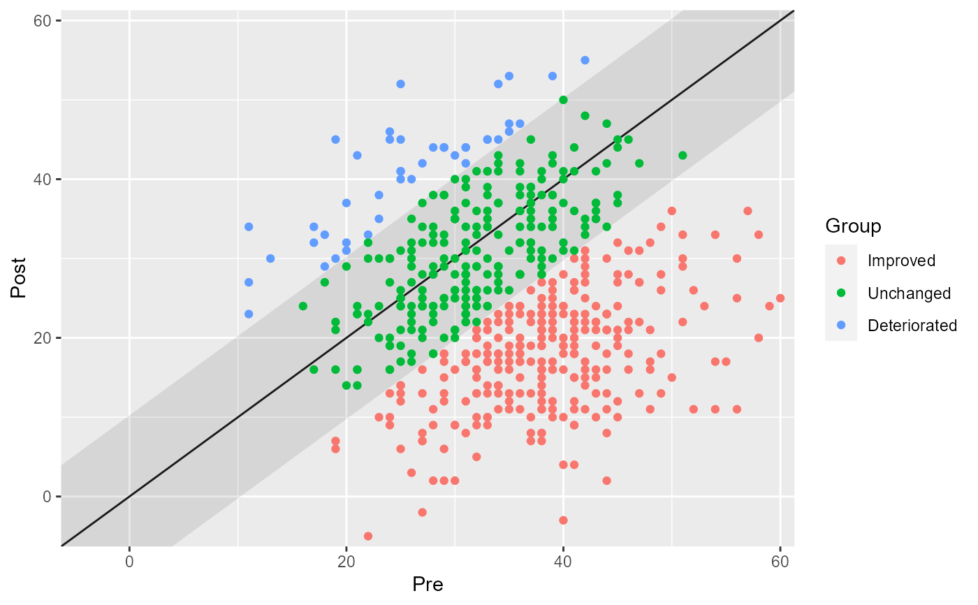
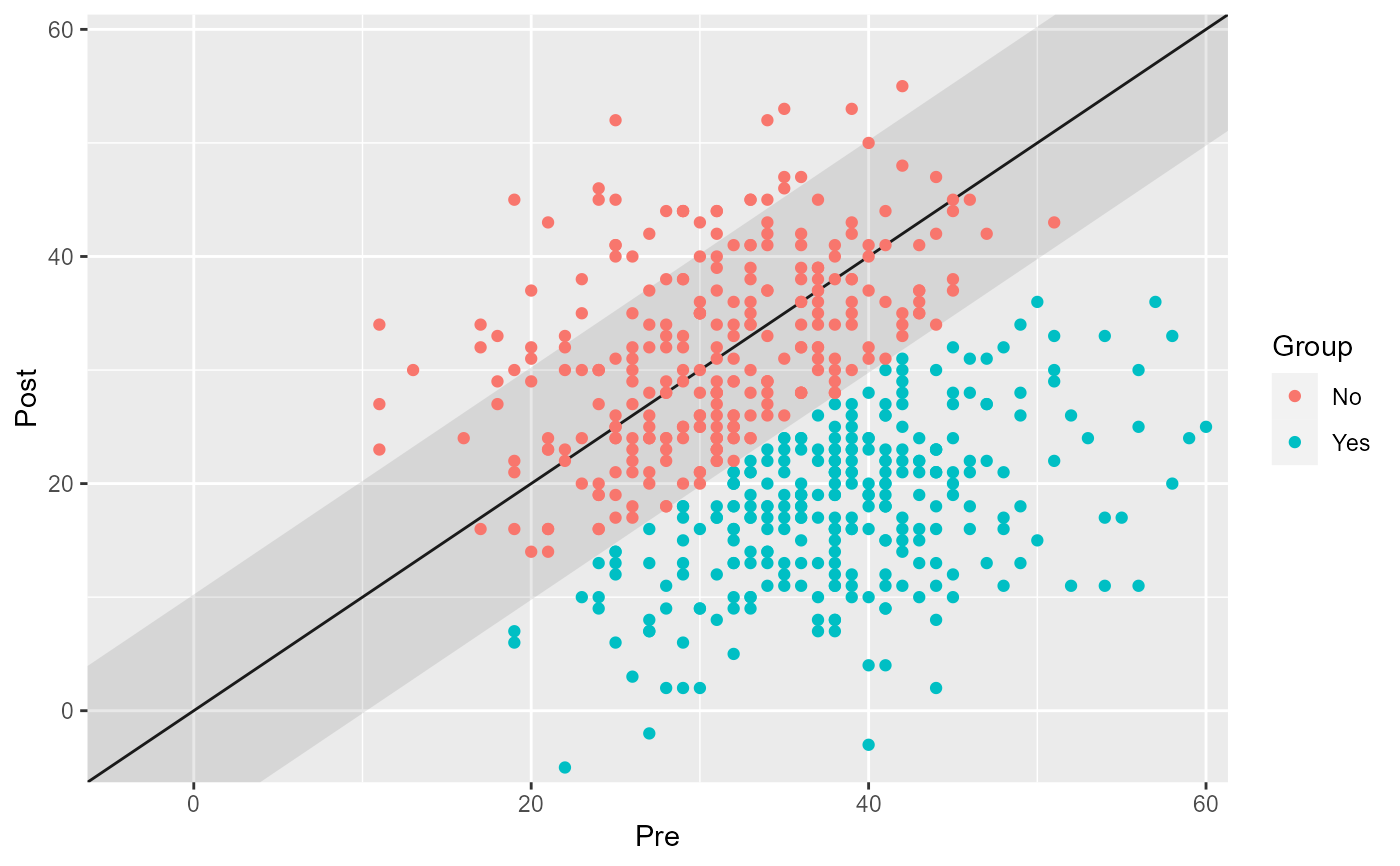
 # Show the individual categories
plot(cs_results, show = category)
# Show the individual categories
plot(cs_results, show = category)
 # Show a specific
plot(cs_results, show = improved)
# Show a specific
plot(cs_results, show = improved)
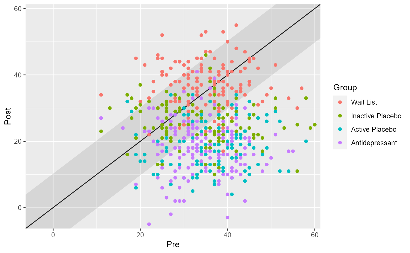
 # Show groups as specified in the data
cs_results_grouped <- antidepressants |>
cs_distribution(
patient,
measurement,
pre = "Before",
mom_di,
reliability = 0.80,
group = condition
)
plot(cs_results_grouped)
# Show groups as specified in the data
cs_results_grouped <- antidepressants |>
cs_distribution(
patient,
measurement,
pre = "Before",
mom_di,
reliability = 0.80,
group = condition
)
plot(cs_results_grouped)
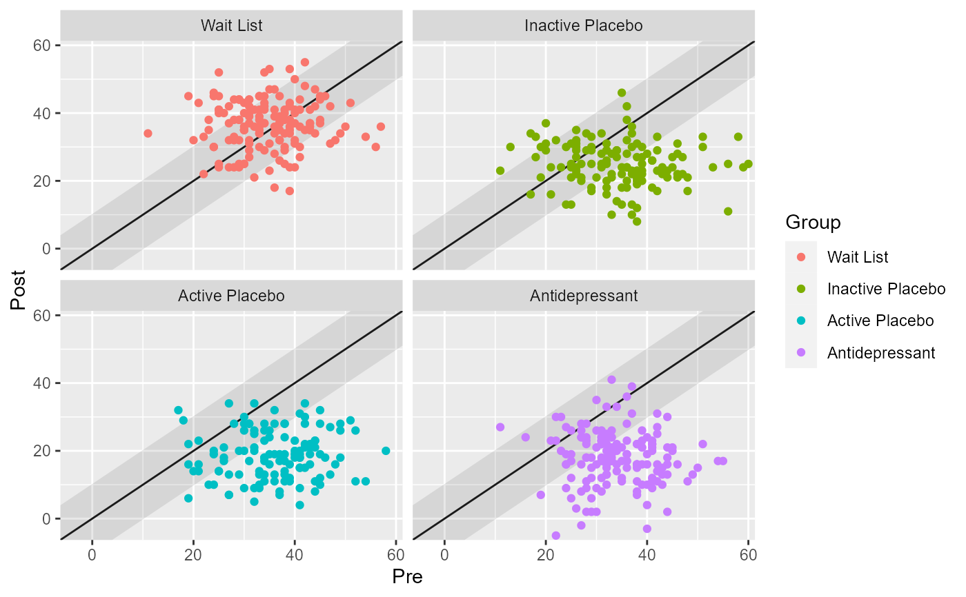
 # To avoid overplotting, generic ggplot2 code can be used to facet the plot
library(ggplot2)
plot(cs_results_grouped) +
facet_wrap(~ group)
# To avoid overplotting, generic ggplot2 code can be used to facet the plot
library(ggplot2)
plot(cs_results_grouped) +
facet_wrap(~ group)
 # Adjust the transparency of individual data points
plot(cs_results, point_alpha = 0.3)
# Adjust the transparency of individual data points
plot(cs_results, point_alpha = 0.3)
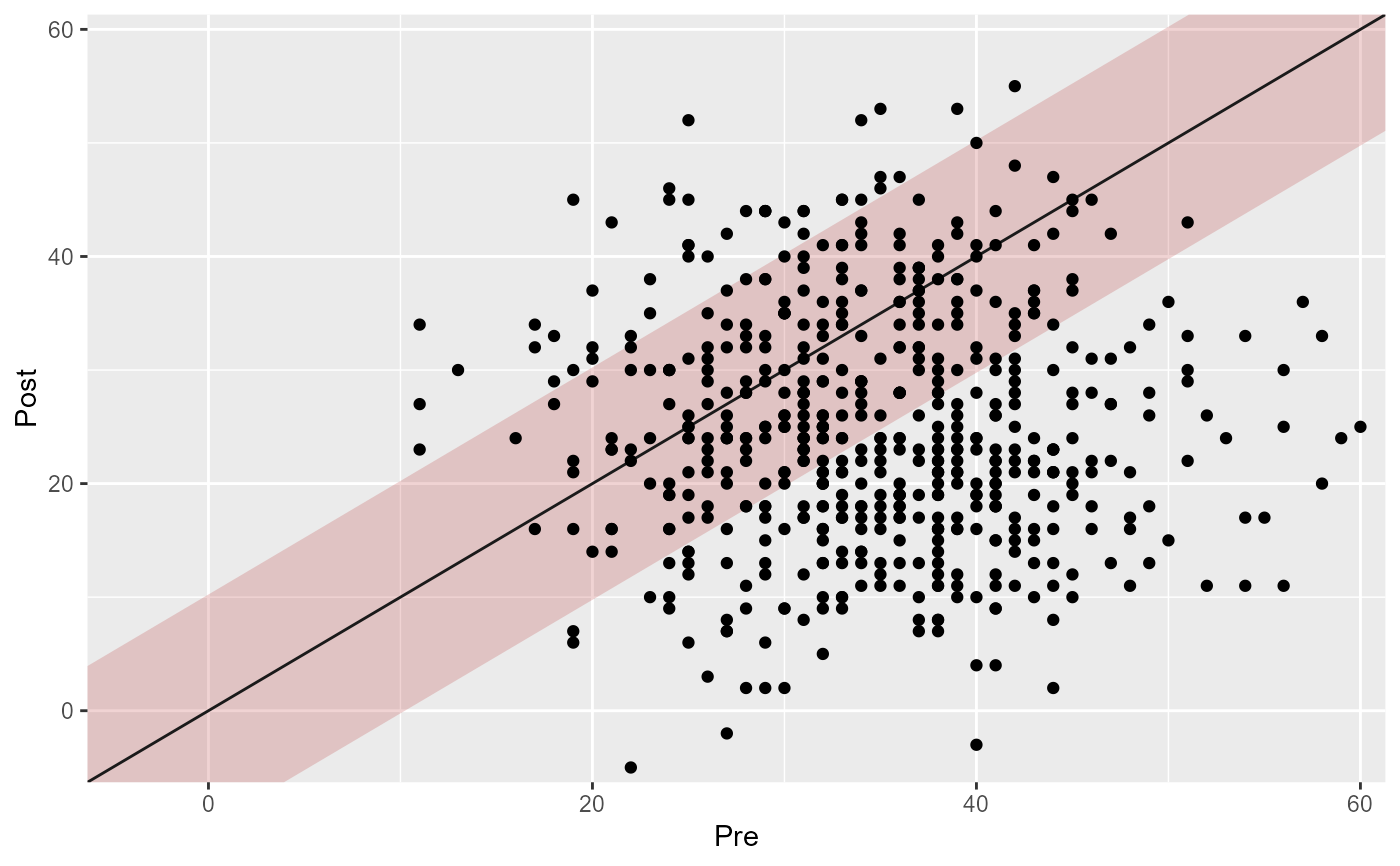
 # Adjust the fill and transparency of the "unchanged" (RCI) region
plot(cs_results, rci_fill = "firebrick", rci_alpha = 0.2)
# Adjust the fill and transparency of the "unchanged" (RCI) region
plot(cs_results, rci_fill = "firebrick", rci_alpha = 0.2)
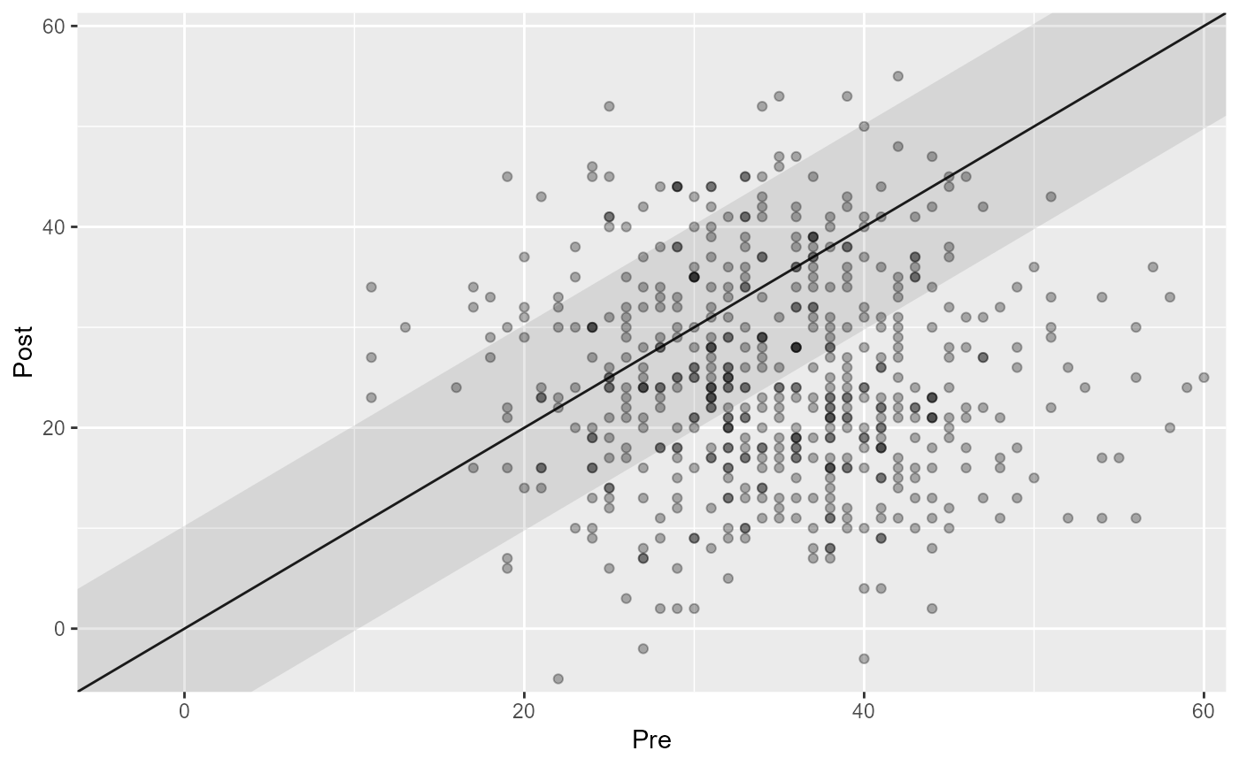
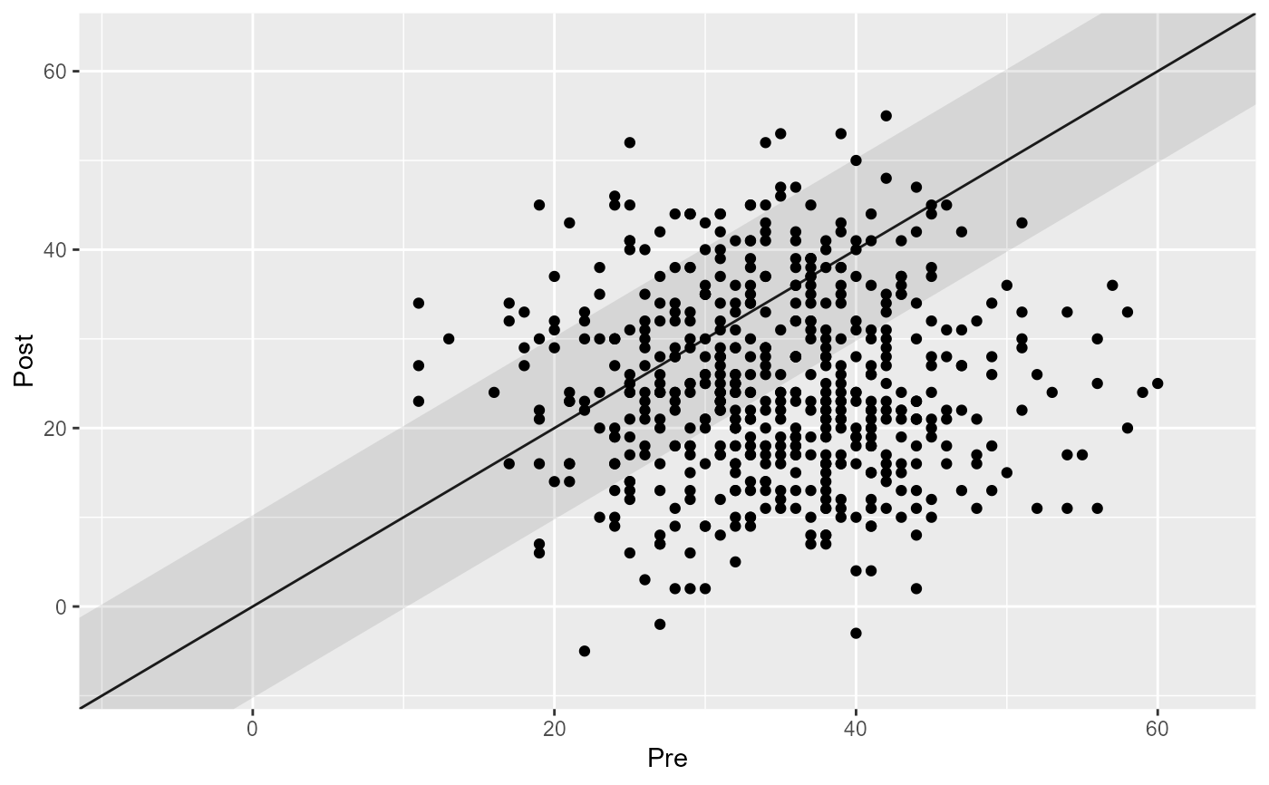
 # Control the overplotting
plot(cs_results, overplotting = 0.1)
# Control the overplotting
plot(cs_results, overplotting = 0.1)
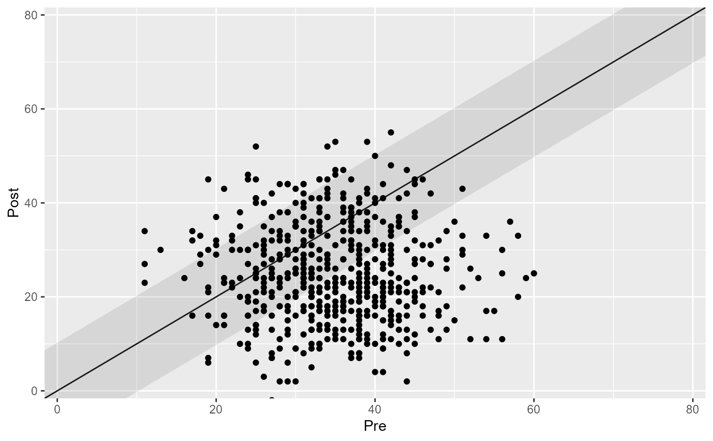
 # Or adjust the axis limits by hand
plot(cs_results, lower_limit = 0, upper_limit = 80)
# Or adjust the axis limits by hand
plot(cs_results, lower_limit = 0, upper_limit = 80)