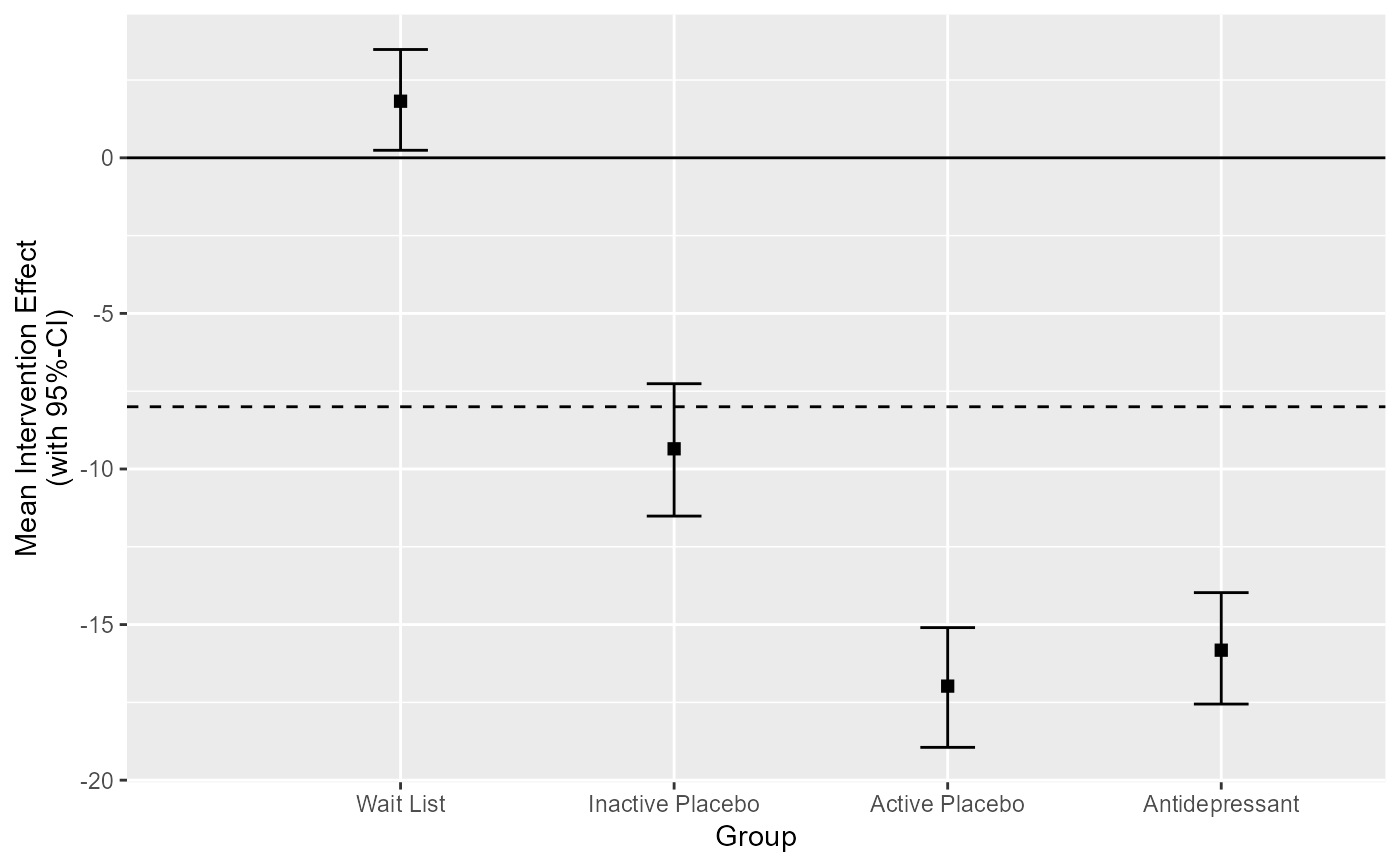
This function creates a generic group level clinical significance plot by plotting the within group change with the associated uncertainty interval around the estimated change on the y-axis.
Usage
# S3 method for cs_anchor_group_within
plot(
  x,
  x_lab = "Group",
  y_lab = "Mean Intervention Effect\n(with 95%-CI)",
  ...
)
Arguments
- x
An object of class
cs_anchor_group_within- x_lab
String, x axis label. Defaults to
"Group"- y_lab
String, y axis label, defaults to
"Mean Intervention Effect (with 95%-CI)"- ...
Additional arguments
Examples
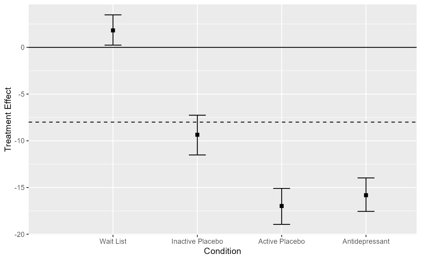
cs_results <- antidepressants |>
  cs_anchor(
    patient,
    measurement,
    mom_di,
    mid_improvement = 8,
    target = "group",
    group = condition
  )
#> ℹ Your "Before" was set as pre measurement and and your "After" as post.
#> • If that is not correct, please specify the pre measurement with the argument
#>   "pre".


# Plot the results "as is"
plot(cs_results)


# Change the axis labels
plot(cs_results, x_lab = "Condition", y_lab = "Treatment Effect")
# Change the axis labels
plot(cs_results, x_lab = "Condition", y_lab = "Treatment Effect")