Clinical Significance Plots
Benedikt Claus
20-12-2022
Source:vignettes/clinical-significance-plot.Rmd
clinical-significance-plot.RmdClinical significance results can be presented in tabular form and as figures. Figures are especially informative and can be used to understand the different clinical significance categories.
Let’s consider the fictitious data set anxiety. This
data set contains anxiety scores of 116 subjects assessed at five
measurements during a psychological intervention. Measurement 0
corresponds to the pre intervention and measurement 4 to the post
intervention assessment. Furthermore, the sample is grouped into two
experimental conditions (Placebo vs. Intervention).
library(clinicalsignificance)

anxiety
#> # A tibble: 580 × 4
#>    subject treatment    measurement anxiety
#>    <chr>   <fct>              <dbl>   <dbl>
#>  1 S001    Placebo                0    36.2
#>  2 S001    Placebo                1    32.4
#>  3 S001    Placebo                2    35.9
#>  4 S001    Placebo                3    32.6
#>  5 S001    Placebo                4    NA
#>  6 S002    Intervention           0    30.1
#>  7 S002    Intervention           1    28.3
#>  8 S002    Intervention           2    34.0
#>  9 S002    Intervention           3    33.1
#> 10 S002    Intervention           4    33.8
#> # … with 570 more rows
Clinical Significance Plot
anxiety_results <- anxiety %>%
  clinical_significance(
    id = subject,
    time = measurement,
    outcome = anxiety,
    pre = 0,
    post = 4,
    reliability = 0.80,
    m_functional = 10,
    sd_functional = 7,
    type = "c"
  )

plot(anxiety_results, upper_limit = 60)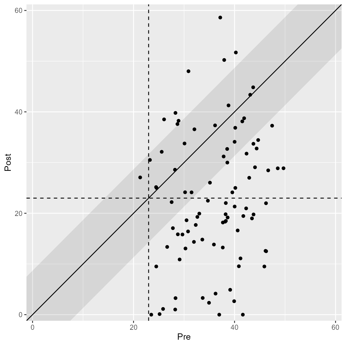
Interpretation
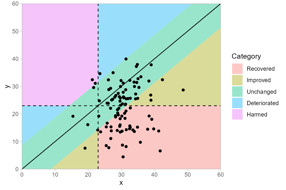
If a lower instrument score corresponds to a beneficial outcome, then the categories in a clinical significance plot can be interpreted according to the figure below.
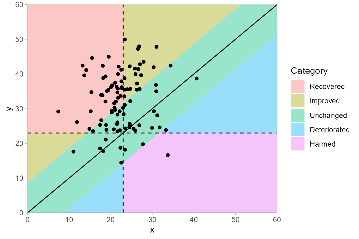
If a higher instrument score corresponds to a beneficial outcome, then the categories in a clinical significance plot can be interpreted according to the figure below. This is the same plot as above, but flipped along the diagonal that indicates no change.
Different Methods
The plot automatically changes according to the specified clinical significance method.
anxiety_results_ha <- anxiety %>%
  clinical_significance(
    id = subject,
    time = measurement,
    outcome = anxiety,
    pre = 0,
    post = 4,
    reliability = 0.80,
    m_functional = 10,
    sd_functional = 7,
    type = "c",
    method = "HA"
  )

plot(anxiety_results_ha, upper_limit = 60)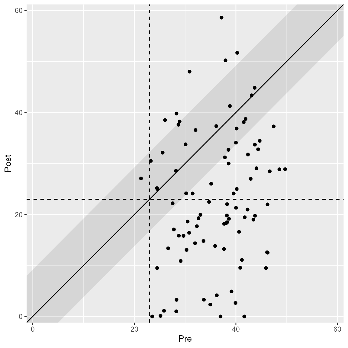
anxiety_results_en <- anxiety %>%
  clinical_significance(
    id = subject,
    time = measurement,
    outcome = anxiety,
    pre = 0,
    post = 4,
    reliability = 0.80,
    m_functional = 10,
    sd_functional = 7,
    type = "c",
    method = "EN"
  )

plot(anxiety_results_en, upper_limit = 60)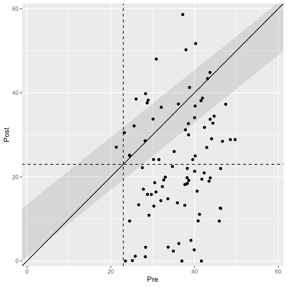
For clinical significance analyses employing the HLM method (Raudenbush & Bryk, 2002), individual trajectories can be plotted as well.
anxiety_results_hlm <- anxiety %>%
  clinical_significance(
    id = subject,
    time = measurement,
    outcome = anxiety,
    method = "HLM"
  )

plot(anxiety_results_hlm, which = "trajectory")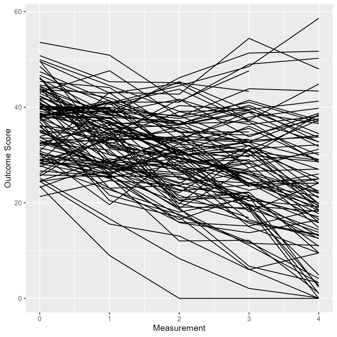
Plot Options
Colors
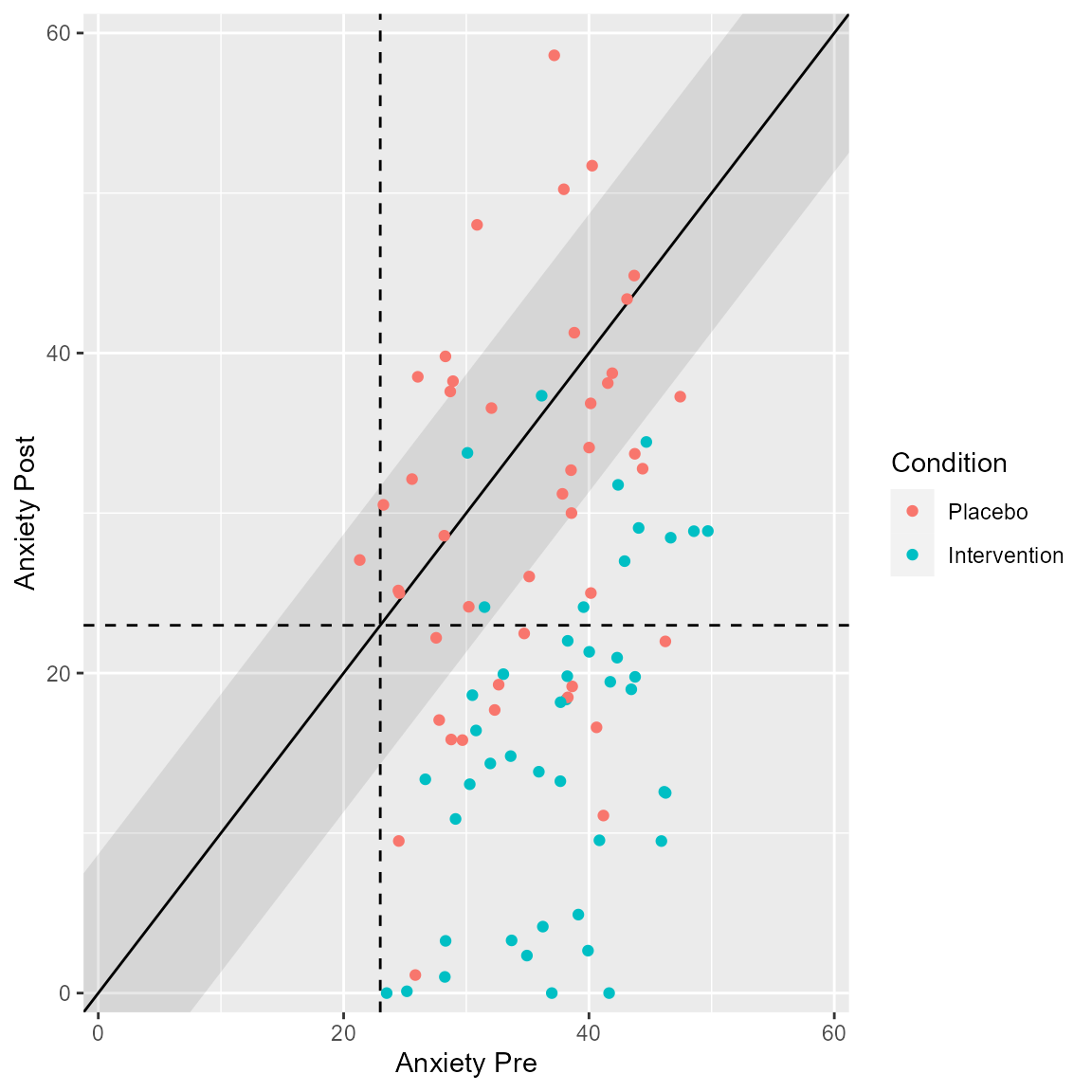
You can choose different categories or groups to be colored separately. If you clinical significance analysis contains a grouping variable, this is automatically shown in the corresponding plot.
anxiety_results_grouped <- anxiety %>%
  clinical_significance(
    id = subject,
    time = measurement,
    outcome = anxiety,
    pre = 0,
    post = 4,
    reliability = 0.80,
    m_functional = 10,
    sd_functional = 7,
    type = "c",
    group = treatment
  )

plot(anxiety_results_grouped, upper_limit = 60)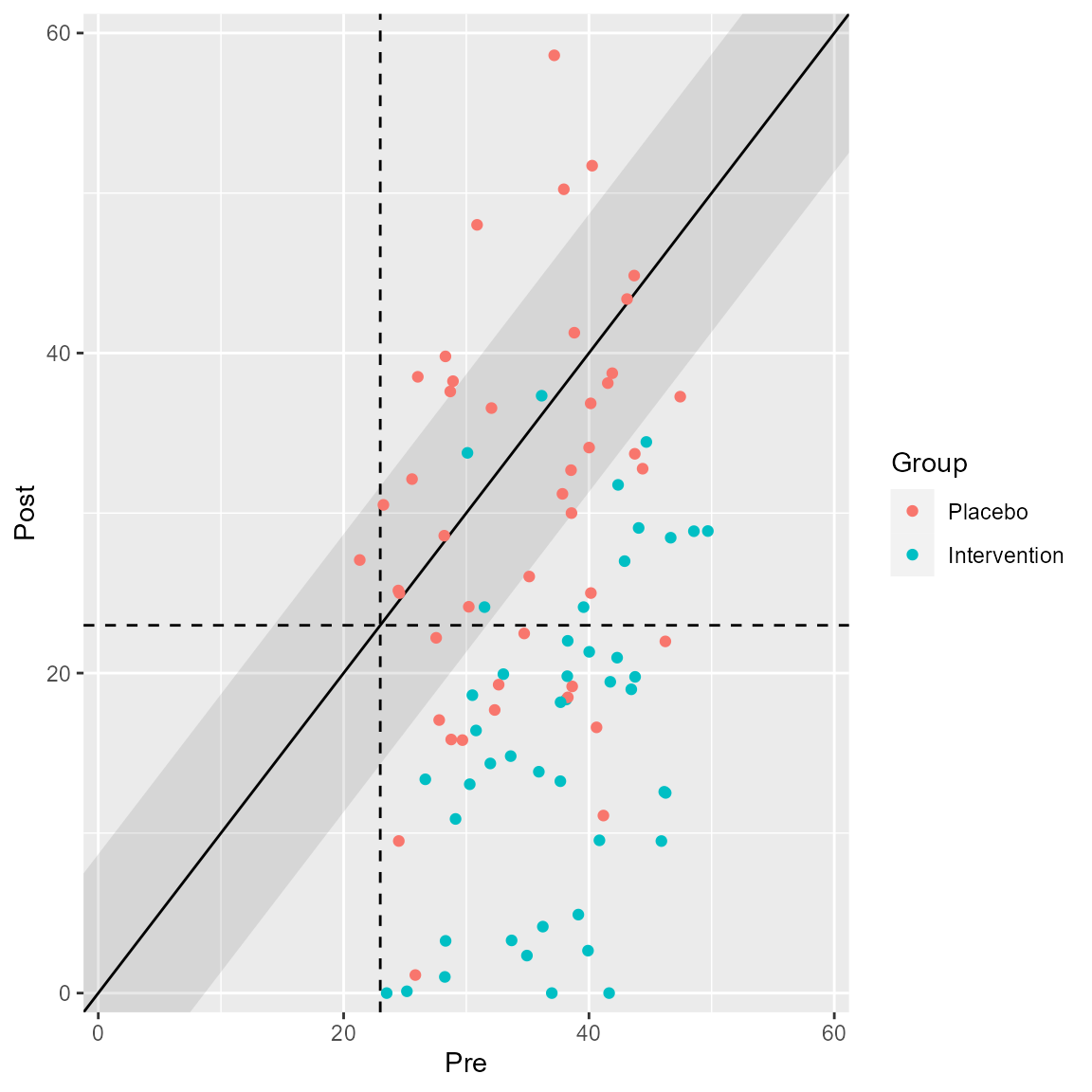
Alternatively, you can color the individual clinical significance categories.
plot(anxiety_results, upper_limit = 60, show = recovered)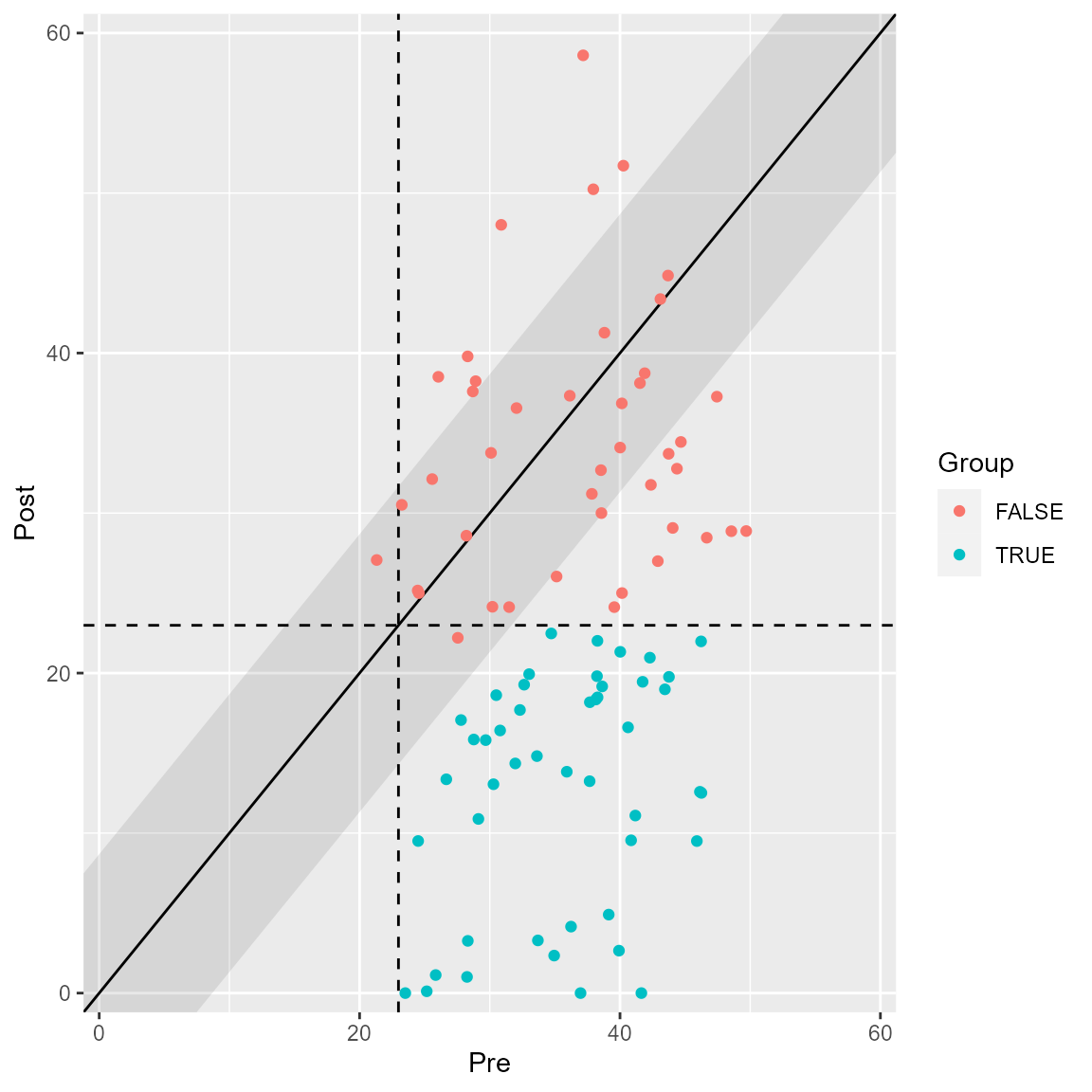
plot(anxiety_results, upper_limit = 60, show = improved)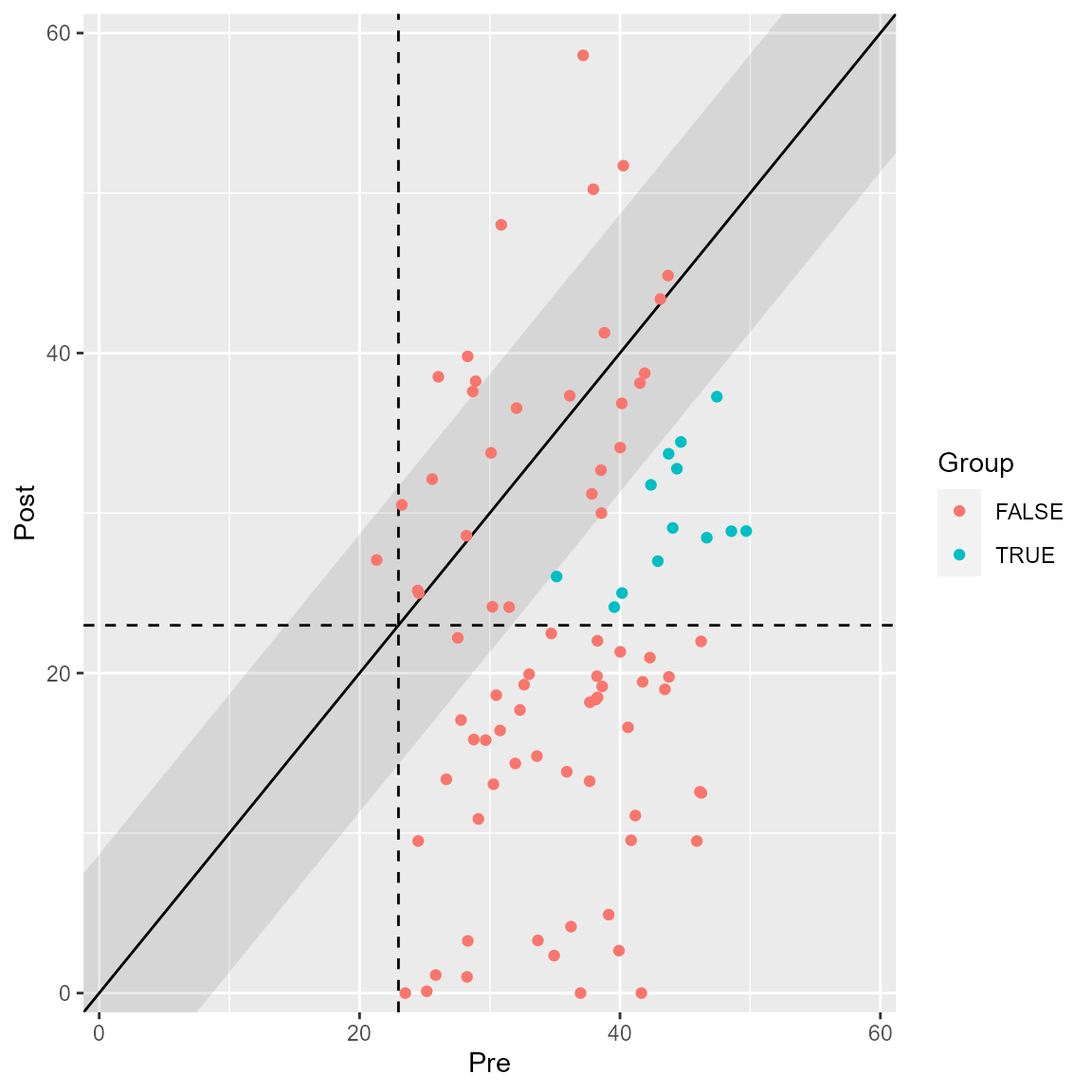
Or all categories at once.
plot(anxiety_results, upper_limit = 60, show = category)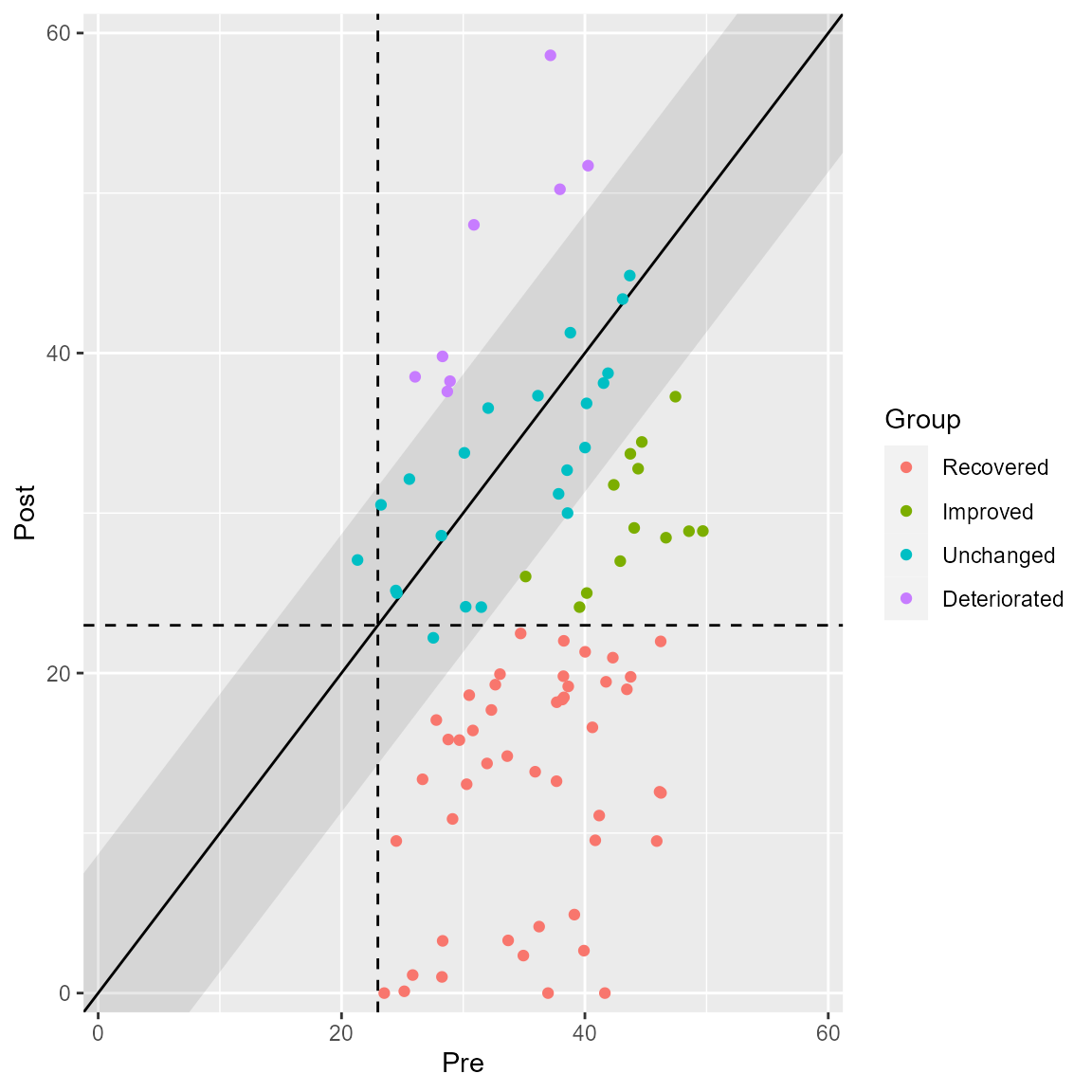
Trajectories for the HLM can be colored as well.
plot(anxiety_results_hlm, which = "trajectory", show = recovered)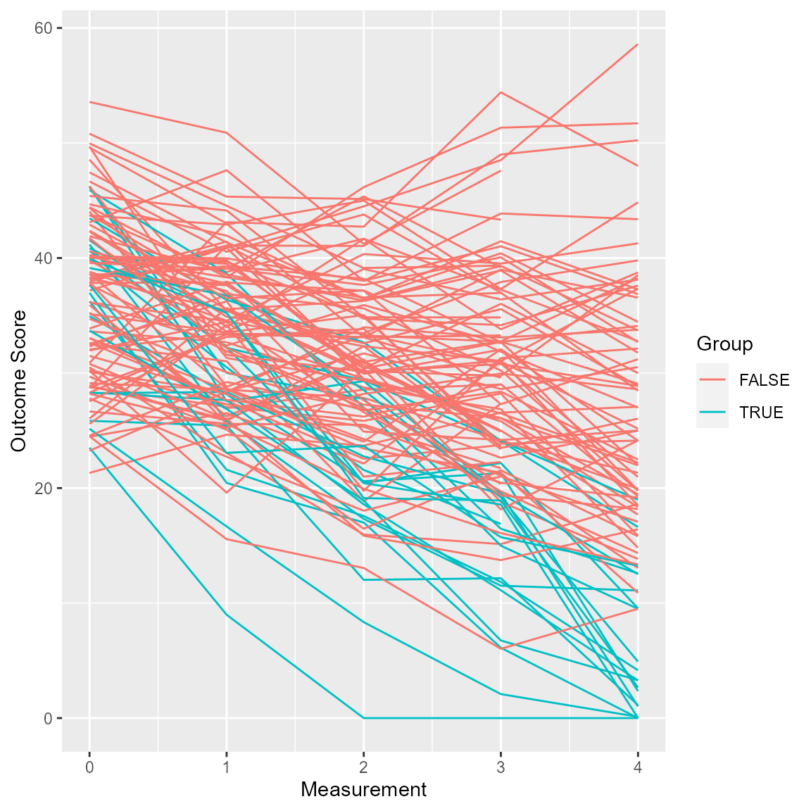
Because clinicalsignificance uses ggplot2 internally,
you can manipulate plots to your liking.
plot(anxiety_results_hlm, which = "trajectory", show = "recovered") +
  facet_wrap(~ recovered) +
  theme_minimal()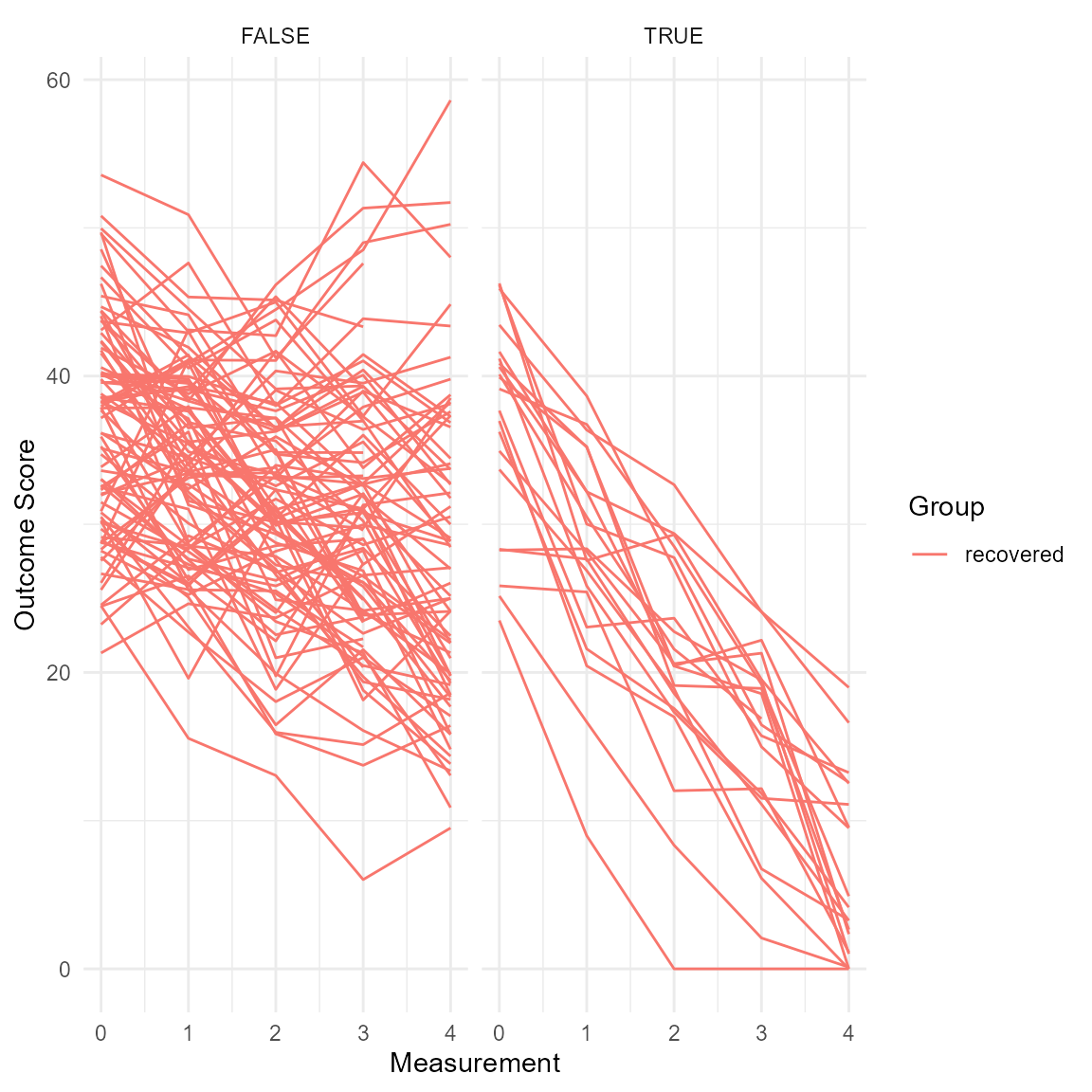
RCI Fill
You can change the display of the RCI band, i.e., its color and transparency.
plot(anxiety_results, upper_limit = 60, rci_fill = "blue", rci_alpha = 0.2)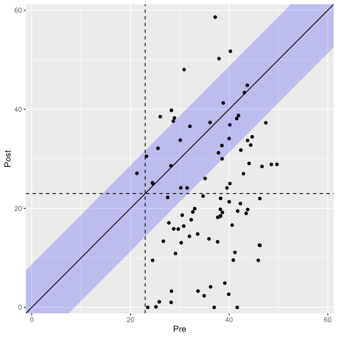
The HA method (Hageman & Arrindell, 1999) considers a band around the post measurement cutoff, which can be plotted as well.
plot(anxiety_results_ha, upper_limit = 60, include_cutoff_band = TRUE)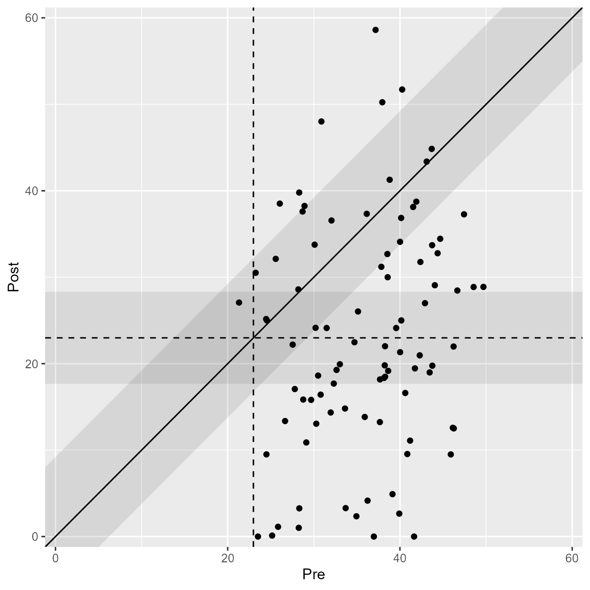
Cutoffs
It is recommended to include the cutoff between the clinical and functional population. By default, they are plotted but can be omitted as well.
plot(anxiety_results, upper_limit = 60, include_cutoff = FALSE)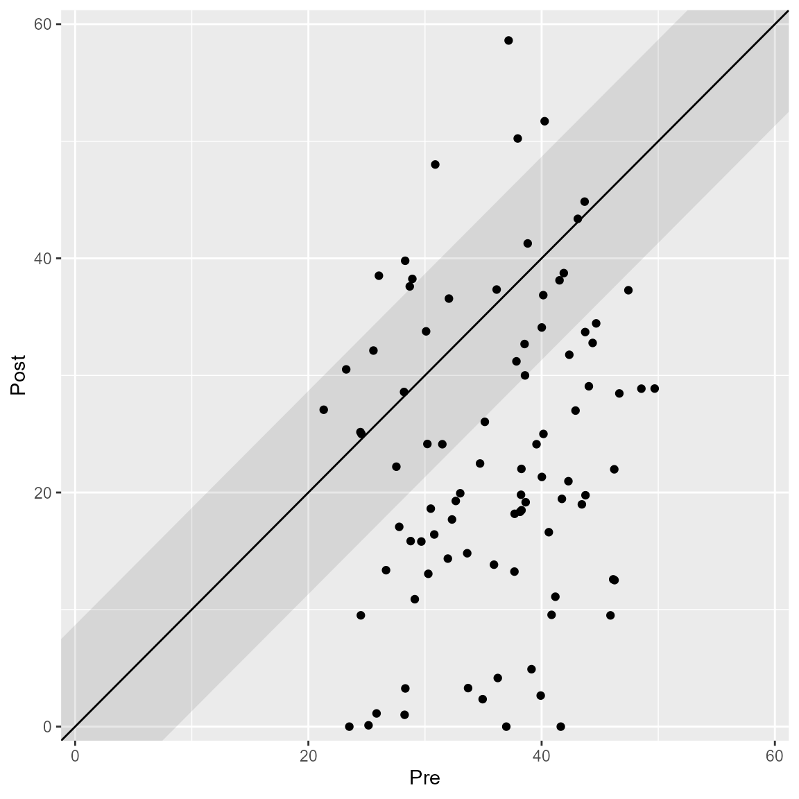
Labels
By default, only generic plot labels are used. You can adjust them to make the figure publication ready.
plot(anxiety_results_grouped,
     upper_limit = 60,
     x_lab = "Anxiety Pre",
     y_lab = "Anxiety Post",
     color_lab = "Condition")