Plot the results of a clinical significance analysis.
Usage
# S3 method for clinisig
plot(
  x,
  lower_limit = 0,
  upper_limit = 100,
  rci_fill = "grey10",
  rci_alpha = 0.1,
  diagonal_color = "black",
  show,
  which = c("point", "trajectory"),
  include_cutoff = TRUE,
  include_cutoff_band = FALSE,
  x_lab = NULL,
  y_lab = NULL,
  color_lab = "Group",
  overplotting = 0.02,
  ...
)
Arguments
- x
A clinisig object
- lower_limit
Numeric, lower plotting limit. Defaults to 0
- upper_limit
Numeric, upper plotting limit. Defaults to 100
- rci_fill
String, a color (name or HEX code) for RCI filling
- rci_alpha
Numeric, controls the transparency of the RCI. This can be any value between 0 and 1.
- diagonal_color
String, a color (name or HEX code) for the line indicating no change.
- show
Category name. You have several options to color different features. Available are
category(shows all categories at once) which is the defaultrecovered(shows recovered participants)improved(shows improved participants)unchanged(shows unchanged participants)deteriorated(shows deteriorated participants, if available)harmed(shows harmed participants, if available)
- which
String. Which plot type should be shown? Defaults to
"point"which yields the default clinical significance plot. The HLM method incorporates multiple measurements per participant, so a reduction to pre and post values may remove important information. Therefore, you can additionally choose to plot each participants trajectory (with"trajectory")- include_cutoff
Logical. Should the clinical cutoff be plotted as well? Defaults to
TRUE.- include_cutoff_band
Logical. If method was HA, a region of uncertainty around the cutoff can be plotted
- x_lab
String, x axis label. Default is
"Pre"for point and"Measurement"for trajectory and slope plot.- y_lab
String, y axis label. Default is
"Post"for point,"Outcome Score"for trajectory, and"Fitted Score"for slope plot.- color_lab
String, color guide label. Default is
"Group".- overplotting
Numeric, control amount of overplotting. Defaults to 0.02 (i.e., 2% of range between lower and upper limit).
- ...
Additional arguments
Details
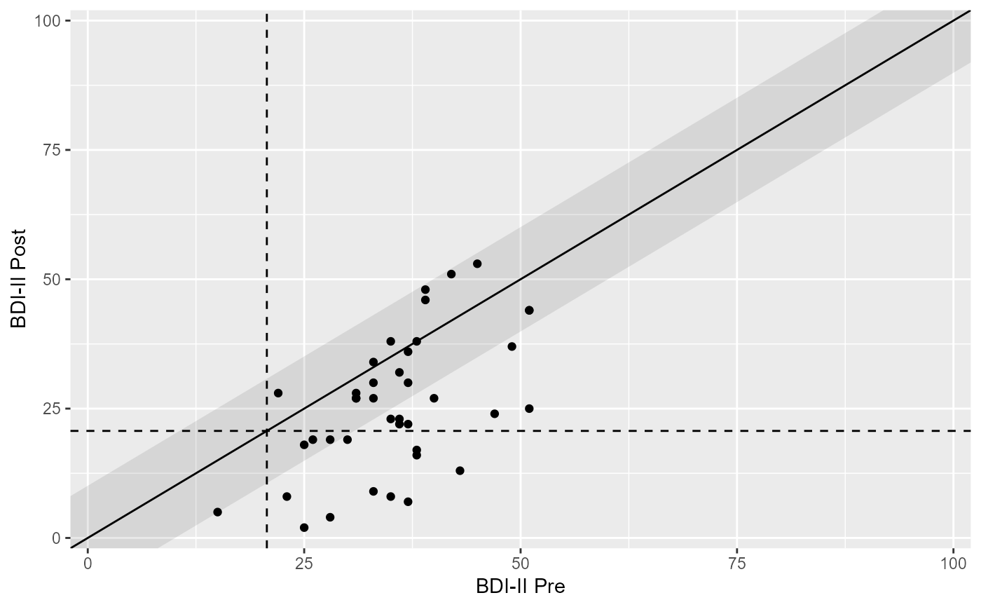
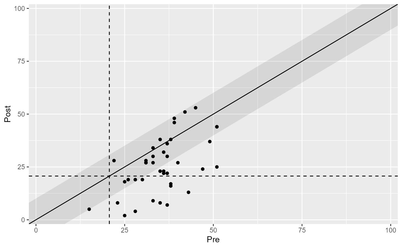
The resulting plot is a generic clinical significance plot with pre-intervention assessment scores on the x-axis and post-intervention assessment scores on the y-axis. By default, the cutoff between the clinical and functional population is plotted as well as the RCI band.
Examples
claus_results <- clinical_significance(
data = claus_2020,
id = id,
time = time,
outcome = bdi,
pre = 1,
post = 4,
reliability = 0.801,
m_functional = 8,
sd_functional = 7,
type = "c"
)
# Base plot
plot(claus_results)
 # Differentiate between groups
claus_grouped_results <- clinical_significance(
data = claus_2020,
id = id,
time = time,
outcome = bdi,
pre = 1,
post = 4,
reliability = 0.801,
m_functional = 8,
sd_functional = 7,
type = "c",
group = treatment
)
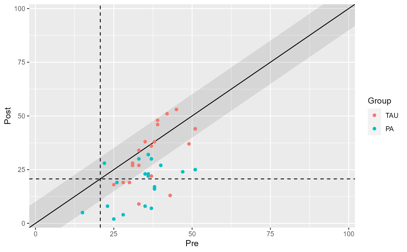
plot(claus_grouped_results)
 # Color individual categories
plot(claus_results, show = recovered)
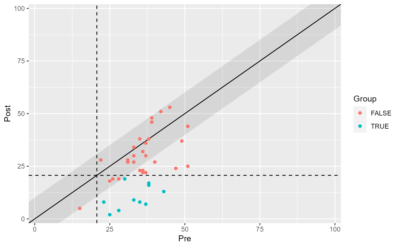 plot(claus_results, show = improved)
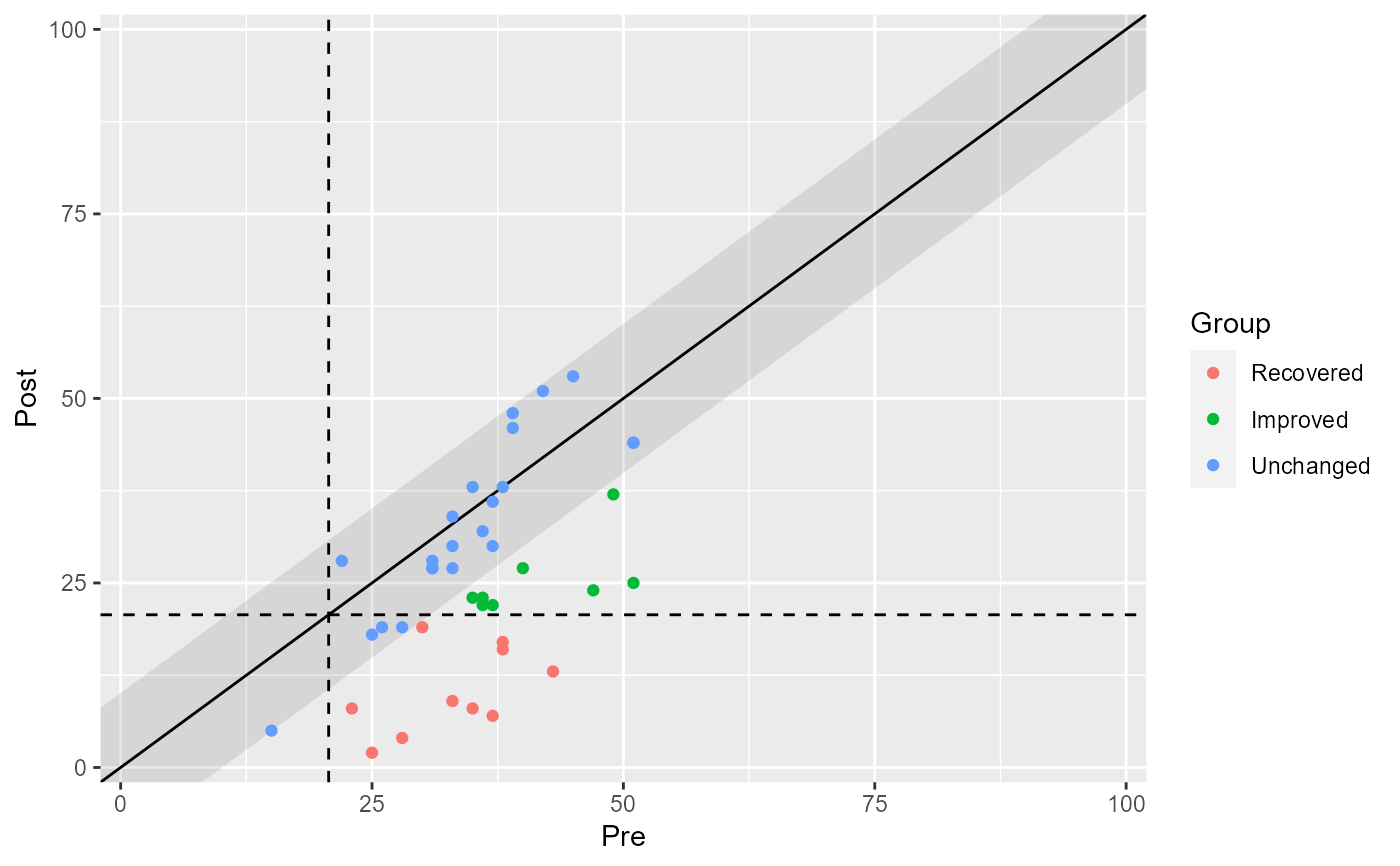
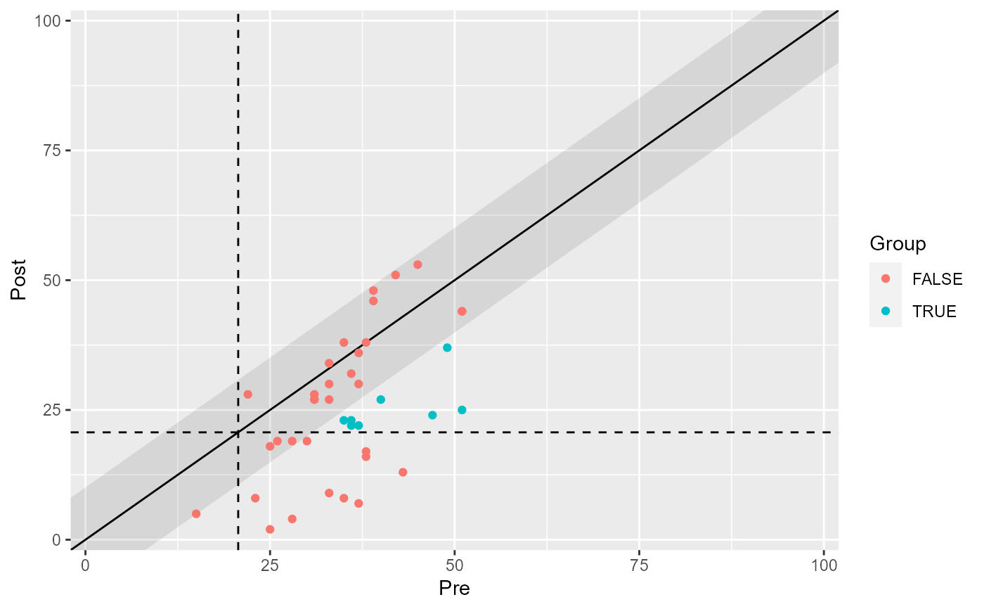 # Color all categroies
plot(claus_results, show = category)
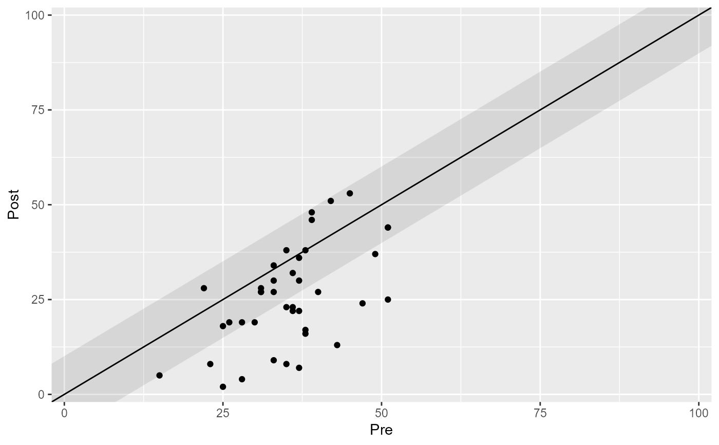
 # Omit cutoff lines
plot(claus_results, include_cutoff = FALSE)
 # Adjust axis labels
plot(claus_results, x_lab = "BDI-II Pre", y_lab = "BDI-II Post")
